Math 1a Spring 2020
1a Introduction to Calculus

Data Stories
Calculus is a beautiful construct which allows us also to deal with data and especially with the models for these data. Here are some blog notes about Quantitative Reasoning with Data (QRD) part of the course. [Update: October 4, 2020. Some of the rather messy blog notes have now been moved elsewhere. There will be a lot to be written about in the future from this time: the gathering of data, the interpretation of data and how to draw conclusions from data. We pure mathematicians are maybe not expert enough to do so. There had been a course MIT 18 .S190 for example at MIT dealing with mathematical and computational modeling in the spring 2000 semester. There is also a GenEd course 1170 now in the fall dealing with more global aspects.]- One of the most important qualities which a scientist must have is to be able to think independently and draw conclusions directly from original data and not from second hand. This has been seen to become difficult in our time.
- When looking at data, we always need to see, where the data come from and how accurate they are. One also has to look who released the data and look behind the motivations behind the interpretations. Critical thinking skills are one of the most important over all.
- Some mathematical models to describe the data turned out to be quite accurate in the current health crisis.
Here is an example: we got the following data from
this website and fitted the data with the Gomperz model. This is a rather scary single variable
function which uses exponential functions, but it works pretty well, as Michael Levitt has pointed out.
It should be added however that the data from Switzerland appeared to be more reliable and
accurate than the data we got in the US. The later show erratic fluctuations. It is important to note
that no definite error bounds are known with health data. The situation is much more difficult than in other fields
like in physics or in climate science.
(* Data from https://www.worldometers.info/coronavirus/country/switzerland/ *)
deaths={0,0,0,0,0,0,0,0,0,0,0,0,0,0,0,0,0,0,0,1,1,1,2,2,3,4,7,11,13,14,19,27,
33,43,56,80,98,120,122,153,192,231,264,300,359,433,488,536,591,666,715,765,821,
895,948,1002,1036,1106,1138,1174,1239,1281,1327,1368,1393,1429,1478,1509,1549,
1589,1599,1610,1665,1699,1716,1737,1754,1762,1762,1784,1795,1805,1810,1823,
1830,1833,1845,1867,1870,1872,1878,1879,1881,1886,1891,1892,1898,1903,1905,1906};
S1=ListPlot[deaths,Joined->True,PlotStyle->Blue]; a=1940; b=0.0805; c=50.8;
S2=Plot[a Exp[-Exp[-b (t - c)]],{t,1,Length[deaths]},ColorFunction->Hue]
S=Show[{S1,S2},PlotLabel->"Fitting with Gompertz model"]
And here is the graph it has produced. 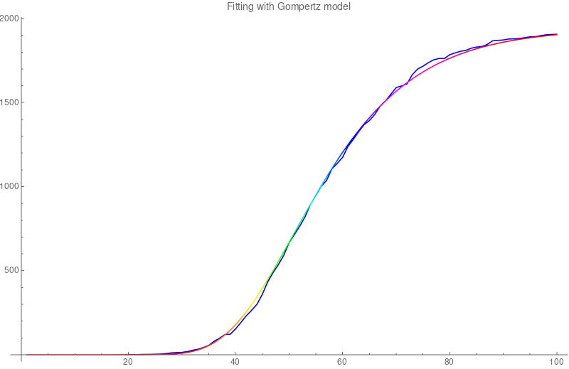
-
At one point, I had asked the class about where to find good accurate COVID 19 data in the US.
Everett (a student in this course) found the following GIT depository from the
New York Times New York Times.
See also
Here are the data in Mathematica form.
A=Import["http://people.math.harvard.edu/~knill/teaching/math1a2020/data/jan21-apr28.m"];
B = Table[A[[k, 3]], {k, Length[A]}]; B1 = Table[B[[k + 1]] - B[[k]], {k, Length[B] - 1}];
S = ListPlot[B1, Joined -> True]; Export["jan21-apr28.png",S,"PNG"]
here is a run done on May 2, 2020 -
It is important to note that health data are not as accurate than other data,
like climate data.
The actual data Lecture
- Mathematica program for the 120 years of temperature data shown in the slides.
- Just two hours after the lecture appears this NYT article has appeared. The data are a bit hard to find here.
- The material about Calculus and Data is here.
- We looked at how pictures can be encoded. Here is the Text file which produces the 1A figure
P3
7 5
255
255 255 255   0   0 255 255 255 255 255   0   0 255   0   0
255   0   0 255 255 255 255 255 255   0   0 255 255 255 255
255   0   0 233 222  77 255   0   0 255 255 255 255 255 255
  0   0 255 255 255 255 255   0   0 255   0   0 255   0   0
255 255 255 255 255 255   0   0 255 255 255 255 255   0   0
255 255 255 255   0   0 255 255 255 255 255 255   0   0 255
255 255 255 255   0   0 255 255 255 255   0   0 255 255 254
You can paste these 9 lines into a text editor, save it as a file 1a.ppm. It produces a 35 pixel picture. I changed one of the 24-bit pixels values to [233 222 77] you see it as a yellow dot in the A. As mentioned in class, changing some of the white values [255 255 255] to say [255 255 254] does not change a thing for the eye. Making small changes like that in a systematic way allows to hide secret messages in pictures. One calls this Steganography. 
From Data to Functions
One of the most important steps is to get from data to functions. This is a pivotal thing as we want to get a model for the data.
Direct Media Links: Webm, Ogg IpodMonte Carlo integration
In Unit 27 we have looked at Monte Carlo integration. The main idea is not to bother about setting up a grid of points at which one evaluates the function but that one randomly chooses points in the interval∫ab f(x) dx ~ ((b-a)/n) * ∑k=1n f(xk)
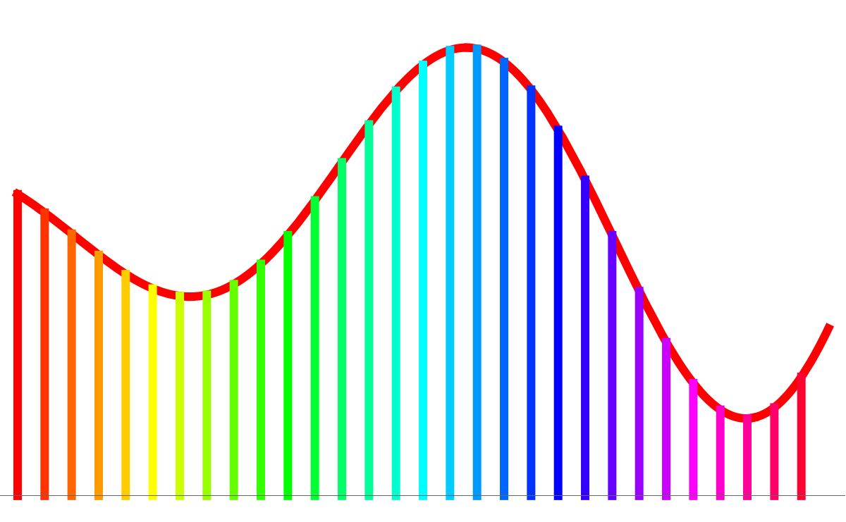
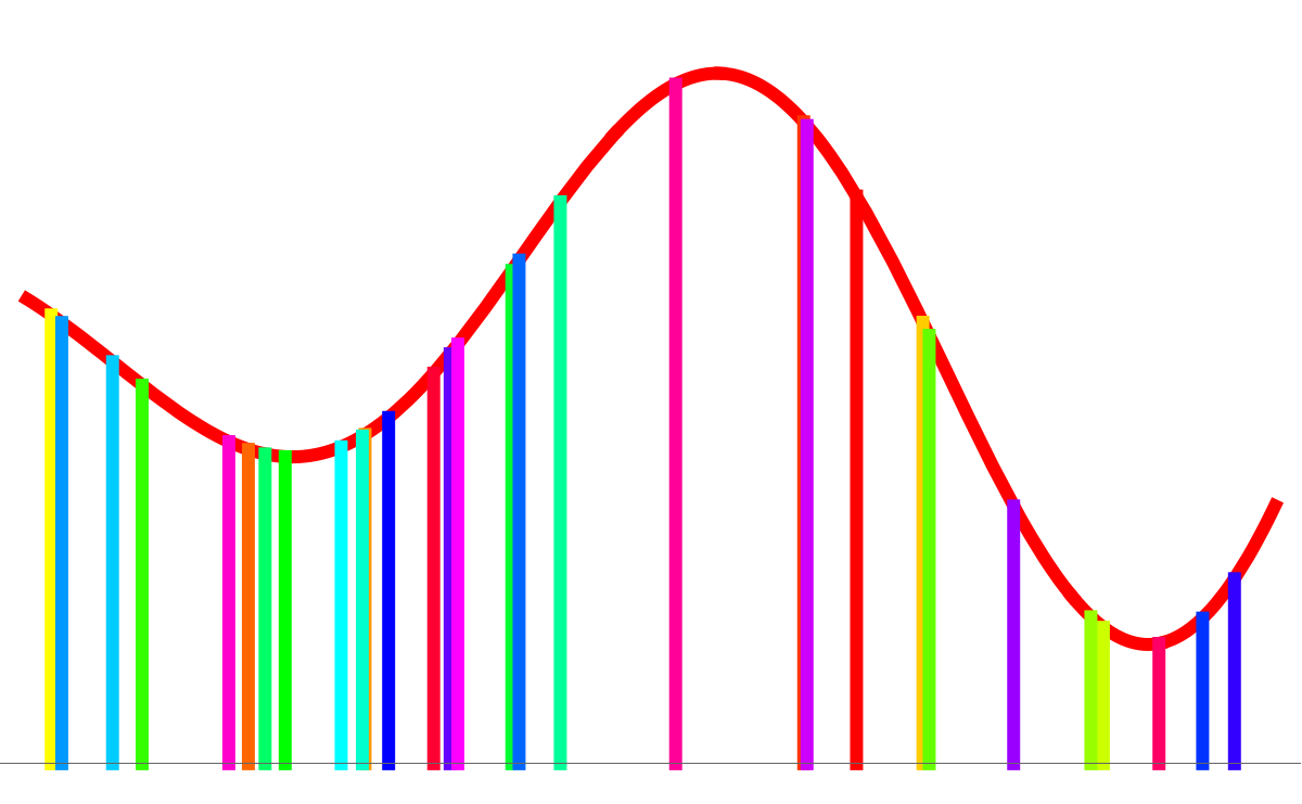
Here the computer was using an equal spaced lattice. Here the computer was randomly picking points Health weather maps
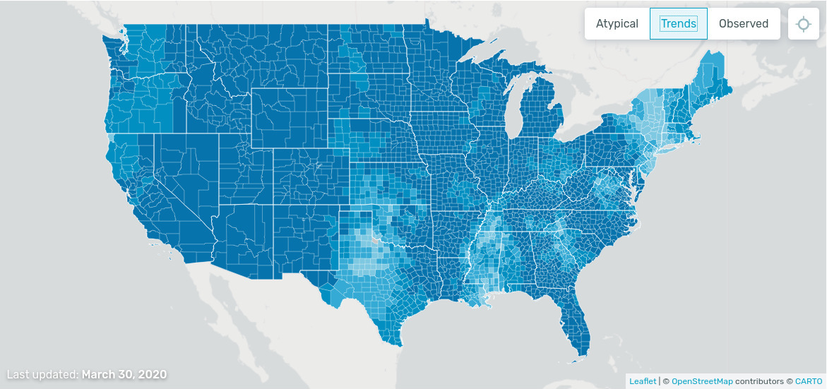
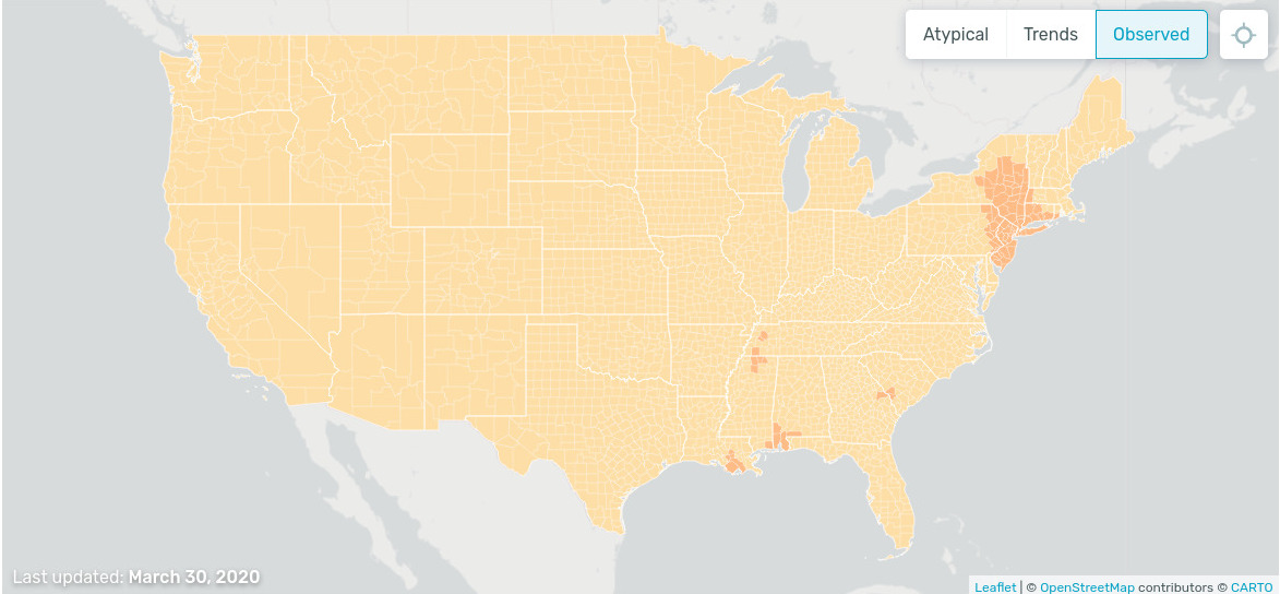
On this website one can see a whether map of illness. The data come from smart thermometers and mobile applications. Interestingly, the illness trend is decreasing: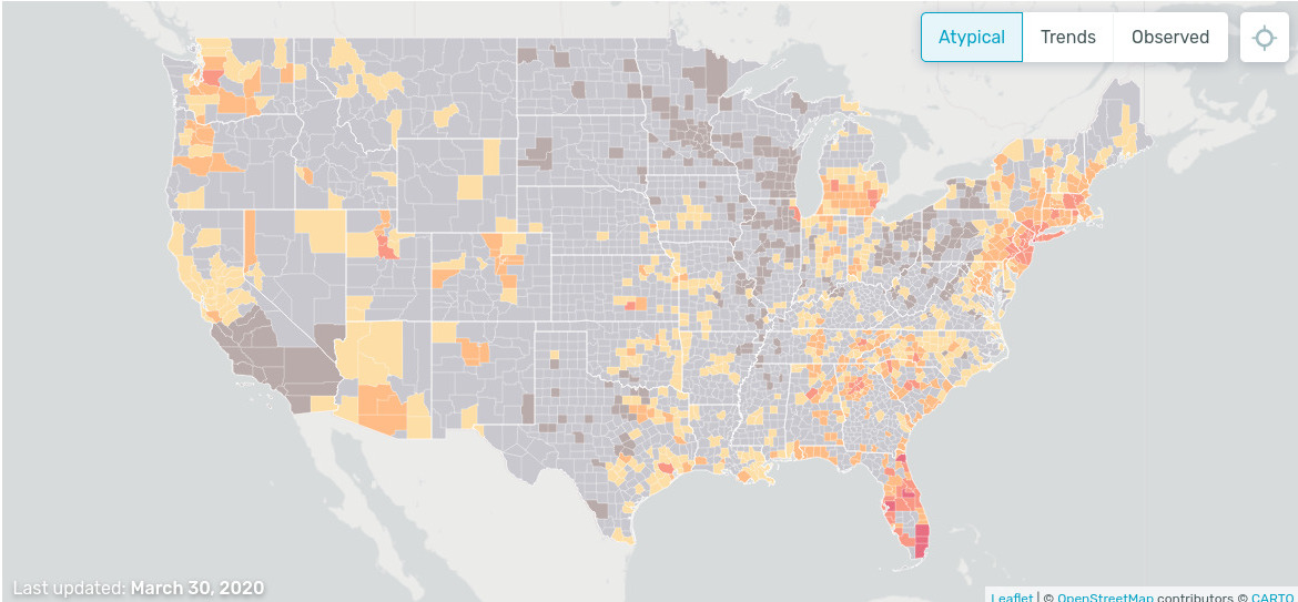
PDF and CDF
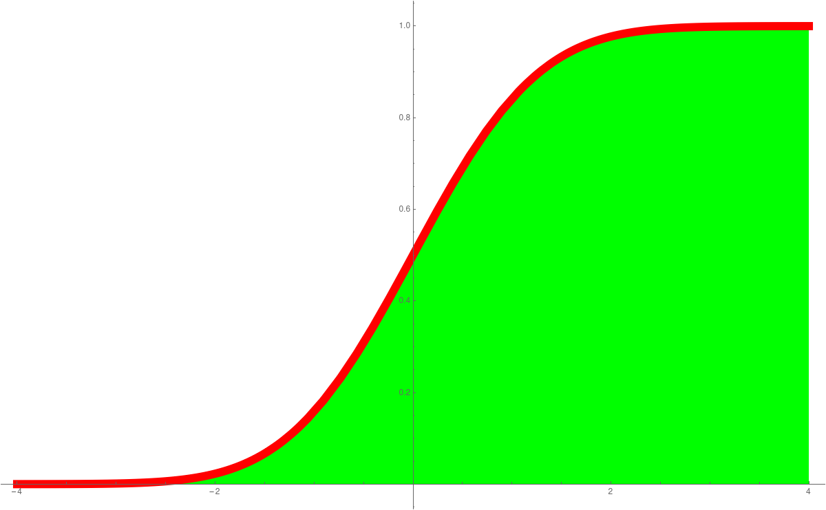
In Unit 23 we looked at probability density functions (PDF) and cummulative distribution functions (CDF). This is a place, where calculus shines in statistics. The derivative of the CDF is the PDF. The standard normal distributione-x2/2/(2 π)1/2
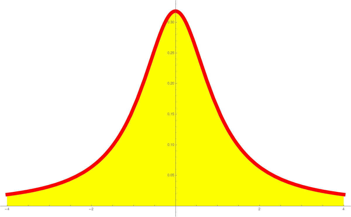
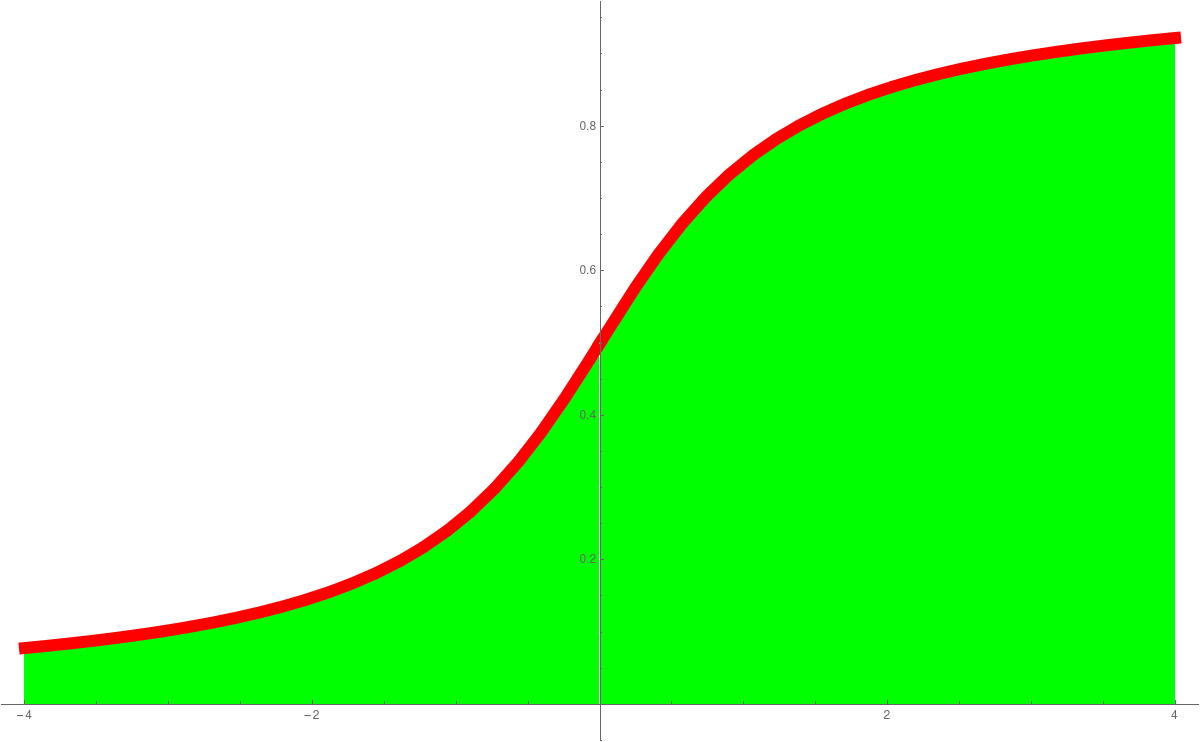
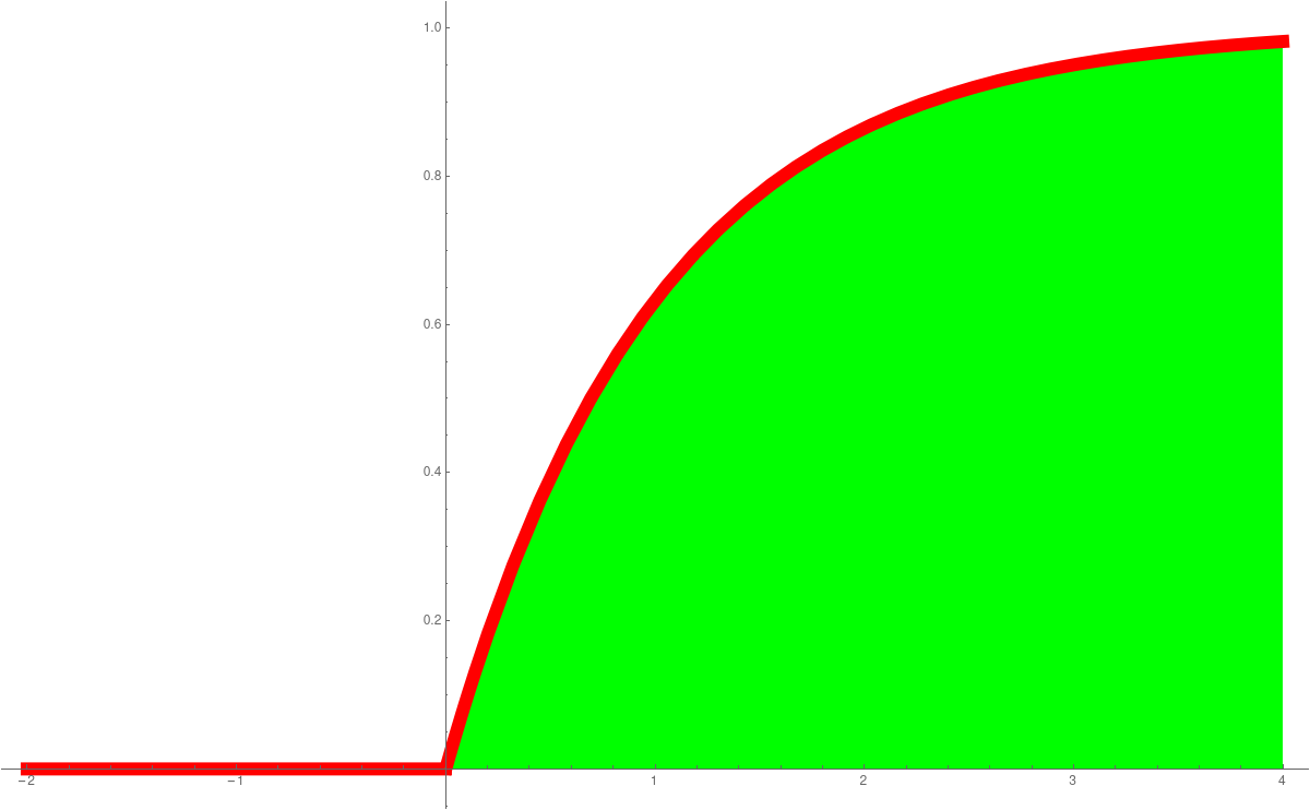
is an example of a function, where we can not find the anti-derivative in closed form. The anti derivative is called Erf(x). These functions are so important, they are hard-wired into computer programming languages like Mathematica. The expressions PDF and CDF are widely used. We can say get the distribution as followsPlot[PDF[NormalDistribution[0, 1], x], {x, -4, 4} Plot[CDF[NormalDistribution[0, 1], x], {x, -4, 4}]We have also seen the Cauchy distributionPlot[PDF[CauchyDistribution[0, 1], x], {x, -4, 4} Plot[CDF[CauchyDistribution[0, 1], x], {x, -4, 4}]the Exponential distributionPlot[PDF[ExponentialDistribution[1], x], {x, -1, 4} Plot[CDF[ExponentialDistribution[1], x], {x, -1, 4}]or the ArcSin distributionPlot[PDF[ArcSinDistribution[{-1,1}], x], {x, -2, 2} Plot[CDF[ArcSinDistribution[{-1,1}], x], {x, -2, 2}]Here are the graphs:PDF Normal CDF Normal PDF Cauchy CDF Cauchy 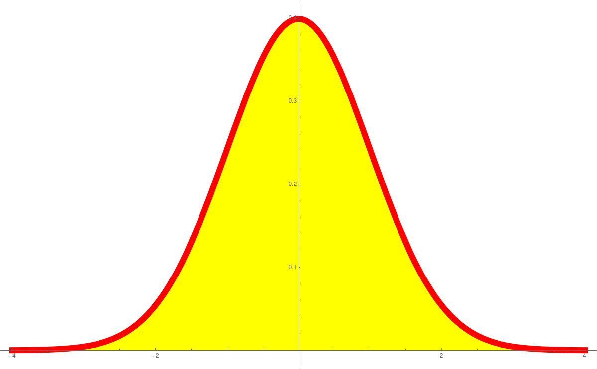
PDF Exponential CDF Exponential PDF ArcSin CDF ArcSin 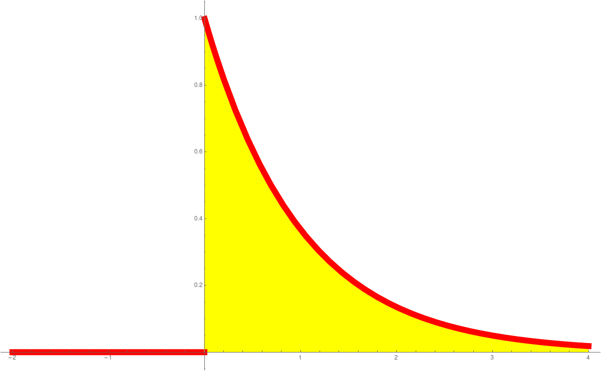
The importance of data
In the current crisis, it becomes evident how important data as well as data models are to predict the best course of action. A recent Washington Post article from March 27 addresses the difficulties we face with data figures. The article also points to research like this which stresses how important the modeling effect can be. The silver lining in any crisis is that with time, the amount of data increases allowing for more and more accurate models. An excellent data visualization in the Corona case has been done by a Swiss programmer: here. The data and programs are (as it should be) available on Github like here.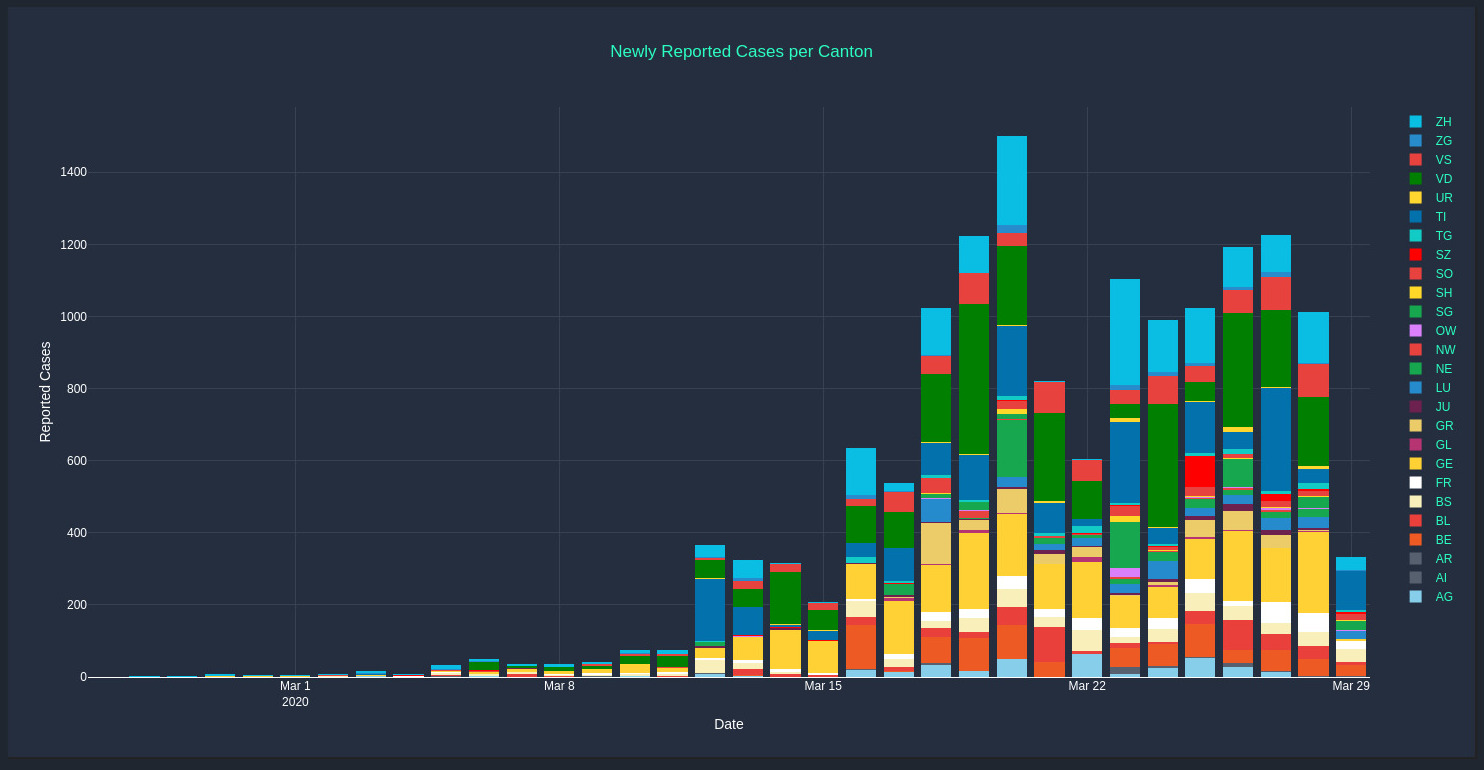
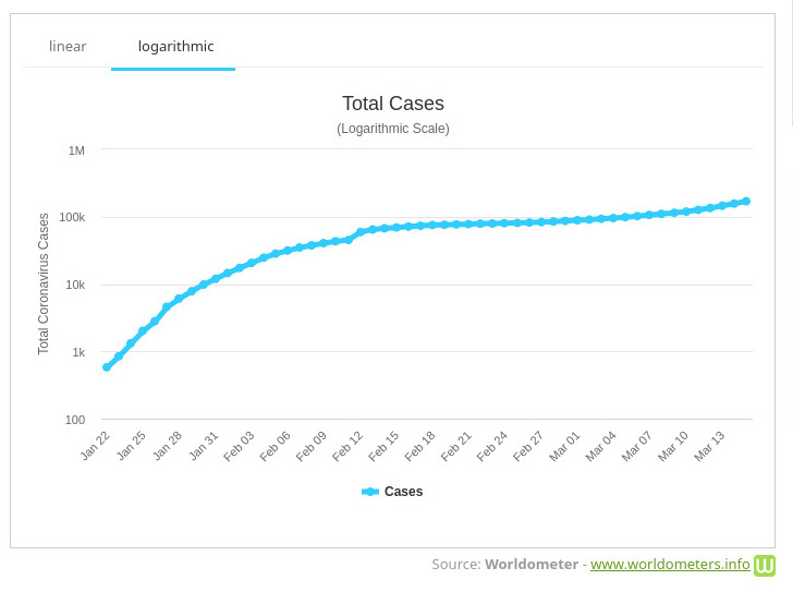
Linear and Logarithmic data display
One can currently see lots of graphs of data about the Corona virus. Here is an example. Usually, these functions are functions of one variable with time as a variable. Sometimes, if the function f(x) grows exponentially, it makes sense to display the function g(x) = log(f(x)). This is called a logarithmic scale. The rate of change of the function log(f(x)) is by the chain rule given by f'(x)/f(x). This is called the logarithmic derivative of f. The logarithmic derivative is the slope of the function in the logarithmic scale. Often, when displaying data, one uses a logarithmic scale. It is good to always watch out for the scale which is used when displaying data.Linear Scale Logarithmic scale 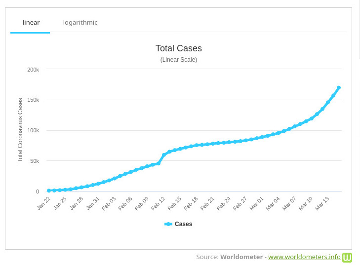
Exponential growth
Videos like the following- How are the data collected? How does this compare to other or similar cases? For example, if a casualty happens, to what cause is it attributed? Such questions are important when making comparisons.
- Do the data fit with models? In an epidemic set-up, simple models lead to exponential growth, more sophisticated models lead to logistic growth. It is difficult to make a model in a new situation as a new situation might have different parameters. It might be much different even and more complicated models need to be built.
- Who releases the data? Are the data vetted or modified? Both can happen. One reason to play things down is to avoid a panic, one reason to hype things is to force action, for example to slow the speed.
Analysis of rate of change
- In the first week we have looked at the rate of change of data
in order to determine the future. Here is a problem used before in this
course Math 1a which also appears essentially as such in the 1A QRD proposal.
You get the following concrete data of GE Stocks from 1962-2020.
A = FinancialData["GE", "Jan.3, 1962", "Mar.3, 2020"];
DateListPlot[A]
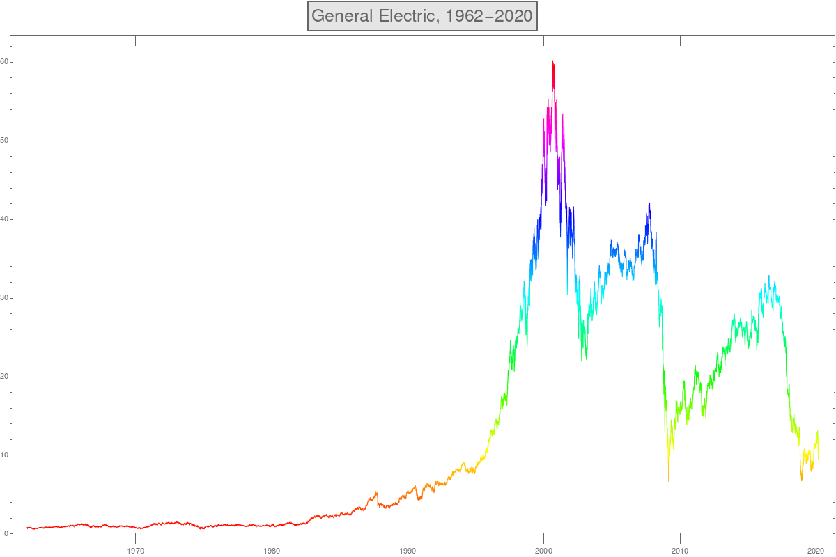 1) How would you model this function? Are there parts where the function
can be modeled as an exponential function?
2) Especially, can you model the growth of the stock prize f(x) for x=1962 to 2000
as an exponential function? How would you get this function?
1) How would you model this function? Are there parts where the function
can be modeled as an exponential function?
2) Especially, can you model the growth of the stock prize f(x) for x=1962 to 2000
as an exponential function? How would you get this function?
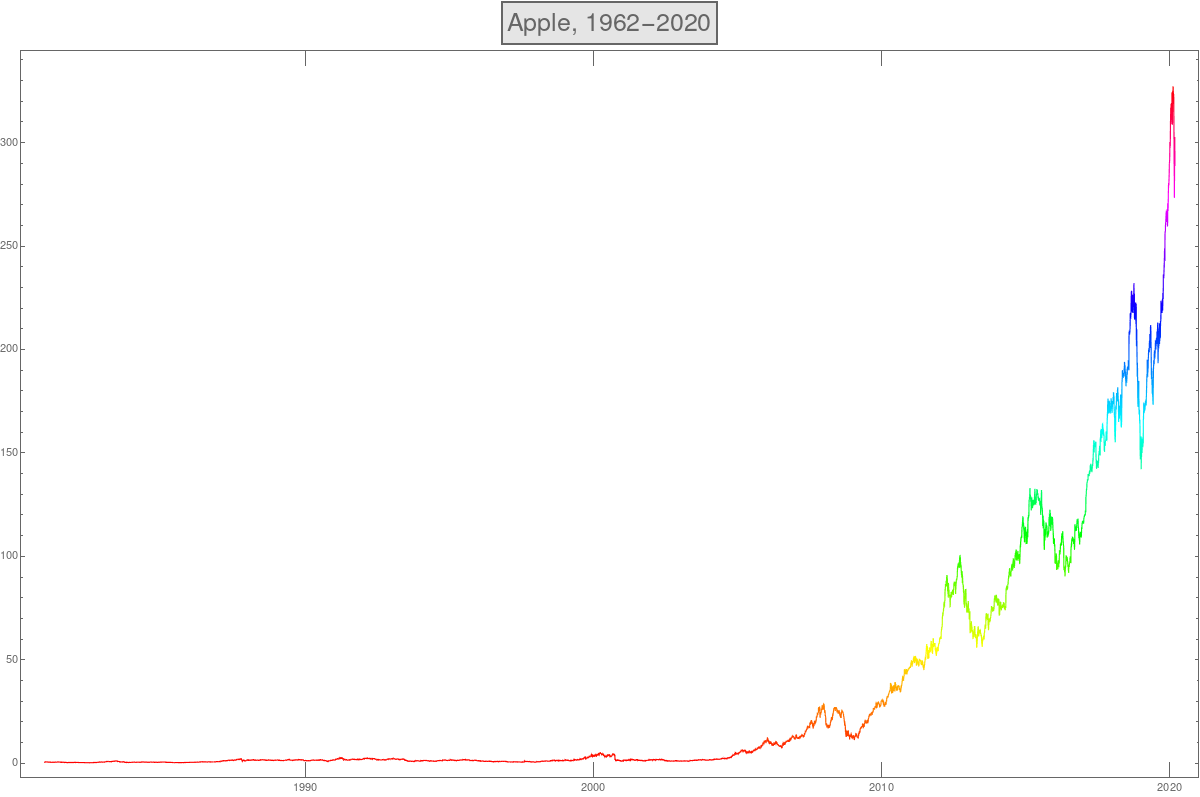
- Here is the analog plot for Apple (APPLE)
A = FinancialData["APPL", "Jan.3, 1962", "Mar.3, 2020"];
DateListPlot[A]
Analysis of numerical data
- In the first week of the course, we have looked at concrete data and used calculus
ideas to see patterns in the data and predict how the data continues. Here is an
example as appearing in the homework:
Assume you see the data set 1, 6, 21, 52, 105, 186, 301, 456, 657, 910
The calculus approach is to look at differences (a discrete analogue of derivative), and repeat taking differences until one sees a pattern. The method allows to detect polynomial growth rates and to predict how the data continue. In the above example, if we take differences we get 5, 15, 31, 53, 81, 115, 155, 201, 253
10, 16, 22, 28, 34, 40, 46, 52
6, 6, 6, 6, 6, 6, 6
- Here is how we can list the first 100 primes in Mathematica
P = Table[Prime[k],{k,100}]How do primes grow? It turns out that Prime(k)/log(k) grows linearly meaning that Prime(k)/(k log(k)) converges to a constant. In other words, the primes grow like the Entropy function f(x) = x log(x) we have seen so many times already!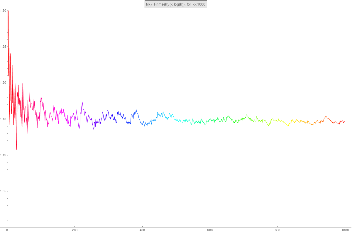
- In the first week of the course, we have looked at concrete data and used calculus
ideas to see patterns in the data and predict how the data continues. Here is an
example as appearing in the homework: